
Alright, so you’ve invested in an ERP analytics platform—now comes the fun part that honestly trips up most founders: actually setting up dashboards that don’t just look pretty but legitimately drive revenue. I get it, the tech can feel overwhelming at first. But once you nail the fundamentals of designing dashboards that surface the insights you genuinely need for making smarter business decisions, you’ll wonder how you ever operated without them. This isn’t about creating every possible chart—it’s about building the three to five dashboards that’ll transform how you run your biz. Let’s get into the exact setup process I use.
Starting with strategy before touching any software
The biggest mistake I see entrepreneurs make is jumping straight into their analytics platform and starting to drag charts around without any plan. That approach creates dashboards that look busy but don’t actually help you make better decisions.
Before you open the software, grab a notebook and answer three questions. What are the specific business decisions you need to make this month? What metrics would make those decisions easier? What early warning signals would help you avoid problems before they blow up?
For example, if you’re trying to decide whether to expand your product line, you need metrics around customer acquisition cost by product, profit margins, inventory turnover, and customer satisfaction scores. If you’re managing cash flow, you need accounts receivable aging, burn rate, runway calculations, and payment collection rates.
Write down your top three business priorities right now. Those priorities determine which dashboards you build first. Everything else can wait.
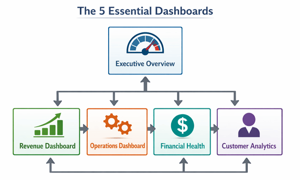
The essential dashboard framework every business needs
Through working with dozens of California startups, I’ve identified a core set of dashboards that almost every business benefits from having. You can customize these based on your industry, but this framework gives you solid coverage of your operations.
Dashboard one is your executive overview. This is your daily morning coffee dashboard that shows revenue, expenses, profit, cash position, and maybe two or three KPIs specific to your business model. Keep it simple. You should be able to glance at this in 30 seconds and know if your business is healthy.
Dashboard two focuses on sales and revenue. Track revenue by product line, customer segment, sales rep, and time period. Include conversion rates through your funnel, average deal size, and sales cycle length. This dashboard helps you understand where money is coming from and where opportunities exist.
Dashboard three covers operational metrics. For e-commerce, that’s inventory levels, fulfillment times, and return rates. For SaaS, that’s user engagement, feature adoption, and support ticket volume. For services, that’s utilization rates, project profitability, and delivery timelines. Whatever your business model, this dashboard tracks whether operations are running smoothly.
Dashboard four is your financial health monitor. Cash flow projections, accounts payable and receivable, expense trends by category, and budget versus actual comparisons. This is the dashboard that keeps you from running out of money or overspending in areas that don’t drive growth.
Dashboard five is customer analytics. Customer acquisition cost, lifetime value, churn rate, retention cohorts, and satisfaction scores. Understanding your customers at this level transforms how you think about marketing and product development.
Connecting your data sources properly
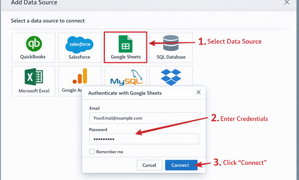
Now we get into the technical part, but don’t worry, it’s more straightforward than you think. Your analytics platform needs access to data from all your business systems, and there are three main ways to make those connections.
Native integrations are the easiest route. Most modern analytics tools have pre-built connectors for popular platforms like QuickBooks, Salesforce, Shopify, and Google Analytics. You literally just enter your credentials, authorize the connection, and data starts flowing automatically. Always use native integrations when they’re available.
API connections come into play when native integrations don’t exist. This requires a bit more technical knowledge or hiring a developer for a few hours, but it’s not rocket science. Your analytics platform makes API calls to your other systems to pull data on a schedule you define.
Database connections are the most powerful option if your data lives in SQL databases or data warehouses. You connect directly to the database and can write custom queries to pull exactly the data you need. This gives you maximum flexibility but requires SQL knowledge.
One crucial thing here is establishing a data refresh schedule. Some metrics need real-time updates, like current inventory or today’s revenue. Others can refresh daily or weekly, like monthly financial reports. Real-time refreshes consume more resources and can slow things down, so be strategic about what actually needs to update constantly.
Designing dashboards that people actually use
The difference between dashboards that get used daily and those that get ignored comes down to design principles that prioritize usability over complexity.
Start with the most important metric at the top left. That’s where eyes naturally go first. Put your north star metric, your most critical KPI, right there in big, clear numbers. For a SaaS company, that might be monthly recurring revenue. For e-commerce, maybe daily sales. Whatever number matters most, give it prime real estate.
Use color strategically, not decoratively. Red means bad, green means good, yellow means caution. Keep it that simple. Don’t make people decode what purple or teal mean. And definitely don’t use a rainbow of colors just because they look cool. Too many colors create visual noise that makes the dashboard harder to read.
Include context for every metric. A number without context is meaningless. If revenue is $50,000 this month, is that good or bad? Show it compared to last month, compared to your goal, compared to the same month last year. Give people the reference points they need to interpret the data correctly.
Limit each dashboard to five to seven key visualizations. More than that and people get overwhelmed. They stop looking at the dashboard because it takes too much mental energy to process. If you need to show more information, create multiple dashboards for different purposes rather than cramming everything onto one screen.
Make it scannable in under a minute. Someone should be able to look at your dashboard and immediately understand the key takeaways without studying it for ten minutes. If your team needs a training session every time they look at a dashboard, you’ve overcomplicated it.
Choosing the right visualization for each metric
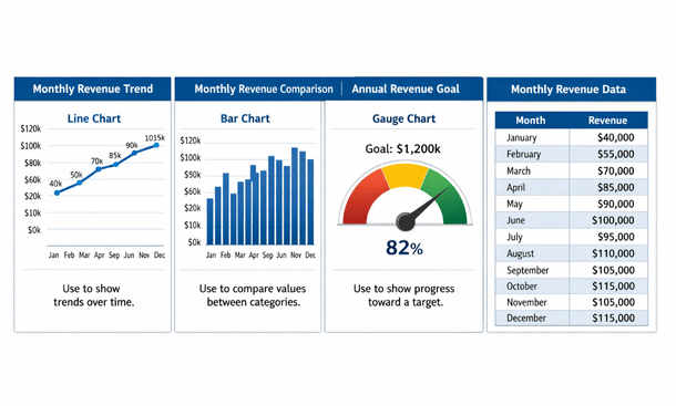
Not every metric should be a pie chart, and not every trend needs a line graph. The type of visualization you choose dramatically impacts how quickly people understand the data.
Line graphs work best for showing trends over time. Revenue growth, website traffic, customer acquisition, anything where you want to see whether something is going up, down, or staying flat over days, weeks, or months.
Bar charts are perfect for comparing different categories at a single point in time. Revenue by product line, sales by region, expenses by department. When you want to see which thing is bigger or smaller than the others, use bars.
Pie charts get a bad reputation but they’re useful when showing parts of a whole, especially when you have three to five segments max. Market share, revenue breakdown by product category, or expense allocation. More than five slices though and pie charts become illegible.
Gauge charts or KPI cards work great for single metrics where you want to show progress toward a goal. If your target is $100,000 in revenue this month and you’re at $73,000, a gauge or progress bar communicates that instantly.
Tables are necessary when people need to see exact numbers or drill into specific details. Use them sparingly though. Tables require more cognitive effort to process than visual charts, so reserve them for situations where precision matters more than quick comprehension.
Setting up filters and drill-down capabilities
Static dashboards that show the same view to everyone are useful, but interactive dashboards that let people explore the data are game-changing. Filters and drill-down functionality turn your dashboard from a report into an analysis tool.
Date range filters are absolutely essential. People need to look at yesterday, last week, last month, last quarter, and last year. Build in easy date selection so switching between time periods is one click, not a configuration nightmare.
Segment filters let people view data for specific customer types, product categories, regions, or whatever dimensions matter in your business. Your sales manager wants to see only their team’s numbers. Your product manager wants to see only their product line. Give them the ability to filter the view without building separate dashboards for everyone.
Drill-down functionality means clicking on a data point reveals more detail. Click on your revenue number to see which products contributed. Click on a product to see which customers bought it. Click on a customer to see their purchase history. This layered approach keeps your main dashboard simple while making deeper analysis available on demand.
The key is making these interactions intuitive. People shouldn’t need to read documentation to figure out how to filter or drill down. If clicking on something makes it interactive, that should be visually obvious.
Creating alerts that catch problems early
The most valuable dashboards are the ones you don’t have to check constantly because they notify you when something needs your attention. That’s where alerts and automated notifications come in.
Set threshold alerts for metrics that indicate problems. If inventory drops below a certain level, send an alert. If customer churn spikes above normal ranges, send an alert. If accounts receivable ages past 60 days beyond a certain dollar amount, send an alert. These proactive notifications let you address issues before they become crises.
Anomaly detection is more sophisticated but incredibly powerful. Instead of static thresholds, the system learns what’s normal for your business and alerts you when something deviates significantly. This catches unusual patterns you might not have thought to monitor explicitly.
Schedule automated reports for regular check-ins. Maybe your executive dashboard emails to your leadership team every Monday morning. Maybe your sales dashboard goes to the sales team every day at 9am. Bringing the data to people rather than making them remember to check it dramatically increases engagement.
Just be careful not to over-alert. If people get 20 notifications a day, they’ll start ignoring all of them. Reserve alerts for things that genuinely require attention or action. Everything else can wait for people to check the dashboard on their own schedule.
Testing and iterating based on actual usage
Your first dashboard design will not be perfect, and that’s completely fine. The goal is to get something functional up quickly, then refine it based on how your team actually uses it.
After your dashboard has been live for two weeks, schedule a feedback session with the people who use it most. Ask them what’s helpful, what’s confusing, what’s missing, and what they never look at. Their real-world experience will reveal insights you couldn’t have predicted.
Check which visualizations people spend time on and which they ignore. Most analytics platforms track user interactions with dashboards. If nobody ever clicks on a certain chart, either it’s not useful or it’s not clear what it shows. Either way, fix it or remove it.
Watch for workarounds people create. If your team is still building spreadsheets to analyze something that should be in the dashboard, that’s a sign you’re missing something important. Figure out what gap they’re filling and add it to the dashboard.
Update dashboards as your business evolves. The metrics that mattered when you had ten customers aren’t the same ones that matter when you have a thousand. Your dashboards should grow and change along with your business priorities.

Common setup mistakes that kill dashboard adoption
Let me save you from the mistakes I’ve watched countless founders make. These are the things that cause dashboards to get built and then never used.
Mistake one is building dashboards that answer questions nobody is asking. Just because you can track a metric doesn’t mean you should. Every visualization should connect to a specific decision or action. If you can’t explain why someone would care about a chart, delete it.
Mistake two is making dashboards too complicated. If your dashboard requires a 20-minute explanation, nobody will use it. Simplicity beats comprehensiveness every single time. Build multiple simple dashboards rather than one complex one.
Mistake three is not considering mobile access. Your dashboards need to work on phones and tablets, not just desktop monitors. A shocking number of entrepreneurs check their numbers on mobile, especially outside normal business hours. If your dashboard is unreadable on a phone, you’ve lost a huge opportunity.
Mistake four is treating dashboard setup as a one-time project instead of an ongoing process. Business priorities change, data sources evolve, and new team members join who need different views. Schedule quarterly reviews of your dashboards to keep them relevant and useful.
Mistake five is not training your team properly. Don’t just build a dashboard and assume everyone will figure it out. Walk people through what each metric means, why it matters, and how to use the interactive features. Fifteen minutes of training saves hours of confusion and ensures people actually use what you’ve built.
Measuring the ROI of your dashboard investment
At some point, you’ll wonder whether the time and money you’re investing in analytics dashboards is actually paying off. Here’s how to think about measuring that return.
Track decision-making speed. Before dashboards, how long did it take to answer questions like “which product line is most profitable?” or “which marketing channel has the best ROI?” After dashboards, it should be seconds or minutes instead of hours or days. That time savings compounds across every decision you make.
Monitor accuracy improvements. Are you making fewer mistakes because you have better visibility into your operations? Are you catching problems earlier? Are you identifying opportunities you would have missed? These qualitative improvements are harder to measure but incredibly valuable.
Calculate time saved on reporting. If you were spending five hours a week manually building reports and now it’s automated, that’s 260 hours per year you’ve freed up. Multiply that by your hourly value and the ROI becomes pretty clear pretty fast.
Look at business outcomes that correlate with dashboard implementation. Did your profit margins improve after you started tracking them closely? Did customer retention increase after you built retention dashboards? While correlation isn’t causation, significant improvements around the time you implement better analytics are worth noting.
The reality is that good analytics dashboards should pay for themselves many times over through better decisions, time savings, and problems avoided. If they’re not, it’s usually because they’re not built well or not being used consistently, both of which are fixable problems.
Building dashboards for different roles in your organization
Not everyone in your company needs to see the same information. Customizing dashboard views by role increases relevance and reduces information overload.
Your executive team needs high-level strategic metrics. Revenue, profitability, cash position, customer growth, and a few key operational indicators. They’re making big-picture decisions about resource allocation and company direction.
Your operations team needs detailed process metrics. Fulfillment times, error rates, capacity utilization, supplier performance, and quality control indicators. They’re optimizing day-to-day execution.
Your sales team needs pipeline visibility, conversion rates, deal velocity, quota attainment, and customer segment performance. They’re managing relationships and closing deals.
Your finance team needs detailed P&L breakdowns, cash flow projections, budget variance analysis, and expense tracking by department. They’re ensuring financial health and compliance.
Your marketing team needs campaign performance, lead generation metrics, cost per acquisition, attribution data, and content engagement. They’re optimizing spend and message effectiveness.
Building role-specific dashboards doesn’t mean recreating everything from scratch five times. Most platforms let you create filtered views of the same underlying dashboards with different metrics exposed based on user permissions.
Taking your dashboards to the next level
You’ve now got the foundation for building ERP analytics dashboards that actually move the needle in your business. The setup process we’ve covered will get you functional dashboards that your team uses daily, but there’s another level of sophistication that top-performing California companies are reaching.
Ready to see how industry leaders are using real-time data to make split-second decisions that compound into massive competitive advantages? Check out our deep dive on real-time ERP analytics and how Bay Area companies make faster business decisions. And if you want the complete picture of how dashboard setup fits into your overall analytics strategy, our comprehensive ERP analytics guide for California entrepreneurs covers everything from selection through optimization.
About the Author

mike
Mike is a tech enthusiast passionate about SaaS innovation and digital growth. He explores emerging technologies and helps businesses scale through smart software solutions.
Did you find this helpful?
Your feedback helps us curate better content for the community.